


Final Boss Bass is a video game themed music festival and cosplay convention created for a project. It "features" multiple stages, arcade and gaming areas as well as as an entire comic-con style convention.
Creating an aesthetically pleasing promotional poster that appropriately communicated the different aspects of the event, whilst still conveying all of the necessary information to promote the event. The poster needed to be something eye catching and enticing for anyone walking by, but it had to appeal to each person in a different way.

I started by focusing on the core components of the event. I assessed what information was most important, what the viewer would be looking for when interacting with this poster, and how this poster would differ from others within the music festival industry. I created a mood board incorporating different popular festival and convention posters and took inventory of some of the key similarities between them all. Once I was happy with my research and preparation, I started working on my layout.
I wanted this poster to be compositionally different from other festival posters typically would, so I decided to format it in landscape as opposed to portrait orientation. Using the content inventory I had created before, I found reference photos of all of the anime and video game characters I intended to use in this poster and spent a fair portion of time deciding upon their layout in Photoshop. Once I had them composed the way I wanted, I exported them to Procreate and used my spread as a template for the main illustration. I utilized a one colour, stencil style of illustration for my characters, and utilized a lot of reds and blacks, hoping to convey a sense of urgency and anticipation. I want the viewer to feel like the poster was calling them to their boss fight.


CLIF Builders Bars are high-protein energy bars designed to support muscle recovery and growth. They’re aimed at active individuals, especially those who lift, train, or need a protein boost post-workout. Intended to be a bold extension of the Clif Bar brand, Builders Bars are supposed to speak to athletes and fitness enthusiasts looking for functional fuel without.
The challenge of this project was to develop a coherently branded packaging series for Clif Builder's Bars, covering at least three different flavours. Clif Builder's Bars are marketed as a quick and convenient source of protein for athletes and busy individuals alike. However, I identified several key issues, including a lack of recycling information and confusing colour choices for flavours. My goal was to redesign the wrappers to address these concerns, ensuring they authentically represent the brand and appeal to the target audience of active, health-conscious consumers. The Bars needed to make the average person want to pick them up, they needed to be bold and scream "I have energy" without being so overwhelming that they may come across artificial.

At the project's outset, I was uncertain about the direction to take. After experimenting with various layouts, I decided to feature a prominent, large colour stripe on the front. Initially, envisioning the design was challenging due to the wrapper's creases being significantly larger than the protein bar itself. However, once I aligned my first prototype with the actual product, structuring the design became considerably more straightforward. As an avid gym-goer myself, I tried to approach this project as more of a consumer than a designer, taking a lot of inspiration from the old school bodybuilding gym I was going to at the time.
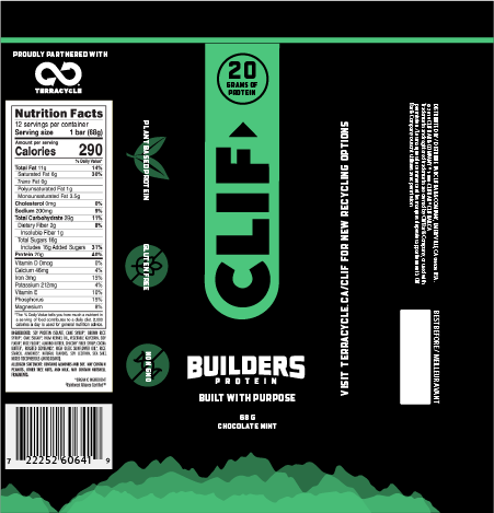


To ensure the wrapper fit the protein bar precisely, I experimented with various paneling techniques and deconstructed several Clif Bar wrappers to examine them in a flattened state. This process allowed me to create a detailed template, mapping out the visible quadrants of the bar. Consequently, I positioned key information, such as the protein content, prominently on the top front for easy visibility, and placed informational icons on the side panels to enhance their prominence when displayed in the box.

Domez Collectibles are stylized mini figures that feature iconic characters from popular franchises, encased in transparent, dome-shaped display cases for a unique and collectible experience. This particular one was for the Deadpool 30th anniversary set.
For this project, I aimed to create a visually appealing package for the Domez collectibles that was more effective and sustainable than the pre-existing. I had to consider ways to make the package more aesthetically pleasing, as well as more functional and environmentally friendly. I had to face various hurdles to do this, such as reducing the plastic waste, finding a better-suited shape for the box itself, and figuring out how the collectible would stay safe and secured without the plastic ring that initially held it in place. With the reduction of plastic in mind, I was perplexed, considering different alternative packaging methods that would incorporate only cardboard. But even though I was greeted with various challenges during this project, I found them to be easily manageable with a little planning and hard work.


I initially focussed on the package structure itself, changing the shape of the box from rectangular to a more triangular shape to reduce the amount of cardboard necessary to contain the product. I then moved on to creating a sort of anchor for the box to replace the plastic sheet that originally held the collectible in place. I opted to create a fan-shaped base that folded around the bottom of the dome and held it in place, which, after a few prototypes, worked beautifully. Once I had the box structure figured out, I moved on to the imagery. I opted to give the stand a gray asphalt texture to contrast the red and back halftone pattern on the outside and elicit a sense of roughness. In addition to this, I also used a halftone pattern on the inside of the box. Using Procreate and Photoshop I redrew the old graphics in a higher quality, re-creating everything I would need from the original box, whilst also creating a few new assets myself. As it was the anniversary edition of the Deadpool Domez set, I wanted to stay true to the original packaging, so I tried my best to keep as many of the pre-existing assets as I could.


Over the summer of 2024 I had the rewarding experience of working at Penny’s Palapa, a floating Mexican restaurant located in the Nanaimo Marina. I initially came on board to redesign the menus before the season kicked off, but soon after, took on the role of social media manager. Throughout the summer, I captured the vibrant atmosphere through photography and videography of the restaurant and its surrounding area. I managed the Instagram account, creating daily posts and reels that highlighted what makes Penny’s Palapa unique, while also teaming up with other local businesses for collaborative posts that helped promote our special offers and events. Additionally, I contributed to the website redesign, providing photography, content, and layout design to give it a fresh, updated look.I had an amazing time working with the team at Penny’s and learned a lot of new skills regarding social media engagement, post timeline creation and food photography during my time in this position.
I was tasked with redesigning the menus for a popular local restaurant, changing the content, refining the layout, and giving them an updated, modern vibe.I was tasked with redesigning the menus for a popular local restaurant, changing the content, refining the layout, and giving them an updated, modern vibe.
I took a very methodical approach to this project. I did my best to retain the homey vibe of the menus whilst giving them a more modern and refined look. I took a lot of consideration towards the legibility of the menus in the bright light of the outdoor dining area. Additionally, I tried to make sure that the fonts featured on the where easily readable for some of our more elderly patrons.
With the addition of new menu items, the food section was definitely the harder of the two. I focussed on creating a balanced layout within each category of dish, trying not to overcrowd the page in the process.
The drinks menu followed roughly the same process as the food menu. With the menus being double sided I decided not to add the Penny's logo to the drinks menu as well.
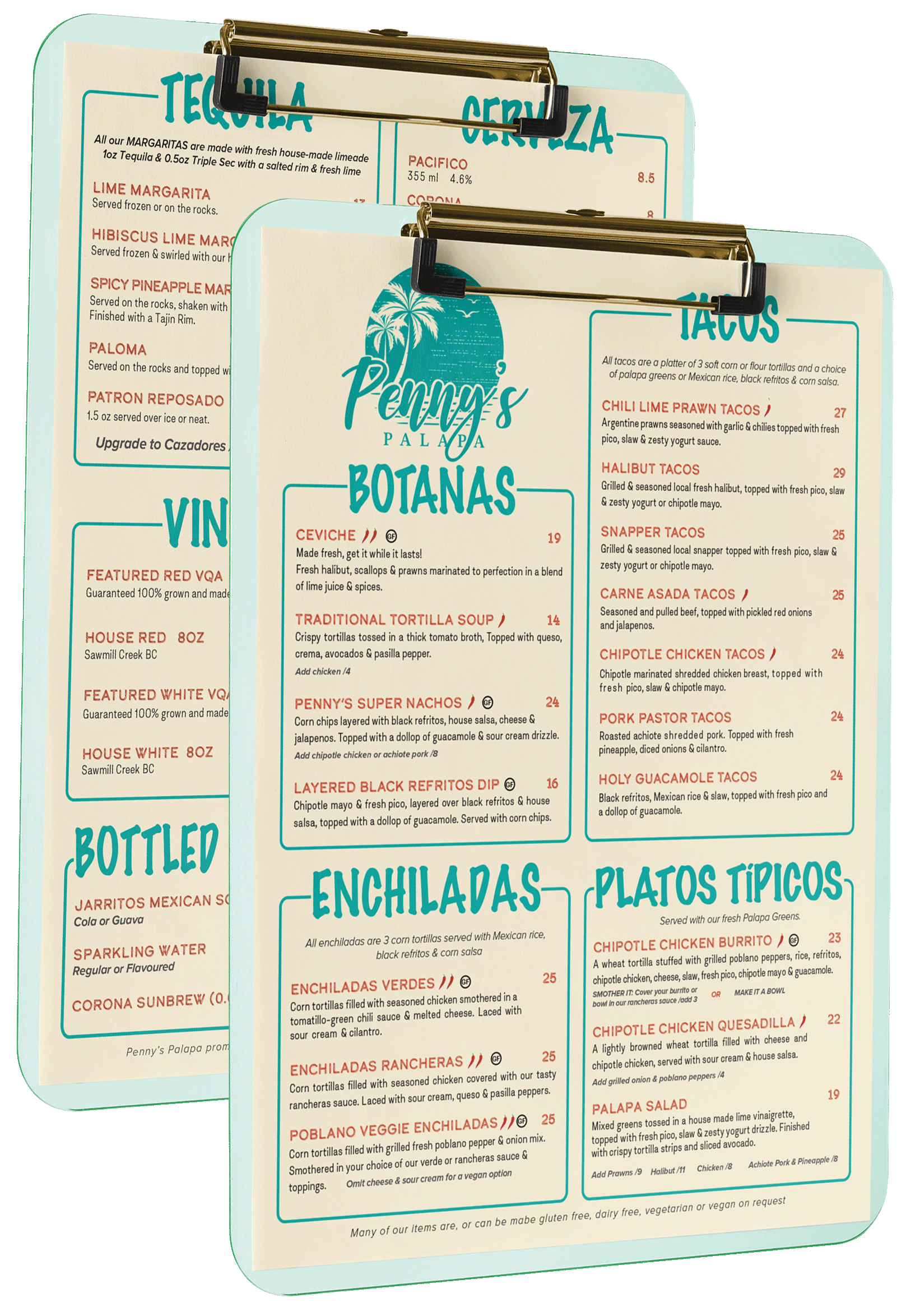
I started by scanning the old menus into InDesign and organizing the content. Using the inventory as a reference, I figured out which dishes would be moving to the new menus and what structure I could use to organize them all. I chose to stick to the categories that the menu already used and created margins within each cell to accommodate the menu items. Once my layout was concrete, I began stylizing. I used a kind of parchment coloured yellow for the background, sourcing the colour from a photo of straw cabanas that was the background for the original menu. After this, I worked on making it fun and playful, really capturing the bright, sunny vibe that Penny’s is known for. I used their signature red and blue throughout the menu headings and chose to use the font Calder Dark Grit Shadow for the main headings. Once my layout and style were flushed out and approved by the owner, I worked in Illustrator to vectorize their pre-existing logo and create all of the small menu asset, such as the variant symbols like gluten-free and spice level ratings.

.jpg)